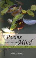
Self-publishing has had a bad reputation caused by too many authors producing badly-written, self-edited books with amateurish cover designs and poor interior formatting. Fortunately, more and more authors choosing the self-publishing route are educating themselves to learn how to produce professional-looking books. This means hiring an editor, a professional cover designer, and a book designer who uses professional-grade publishing software to format the text. Most authors do not have these skills and do not understand all that goes into good cover design and formatting. Save up and hire people who do! Please do not contribute to self-publishing’s bad reputation.
Those who publish their memoir or book of life stories solely for family and friends do not need to hold themselves up to the highest standards. Family will appreciate whatever you write, even if it is not written that well, even if it is printed and bound by a local copy shop. Do have a few family members and friends read the manuscript and note any typos or grammatical errors or sentences that are not clear in meaning.
Authors who publish for family only can format in MS Word. Authors who publish with Amazon’s CreateSpace can submit MS Word-formatted manuscripts–not recommended, but some may insist for financial reasons. Authors who use Lightning Source or the new Ingram Spark for printing had better use Adobe InDesign or other pro-grade publishing software for their manuscript formatting. Authors using MS Word should be knowledgeable about the finer points of the program and learn some basics of proper book formatting so the interior of the book will look asthetically pleasing and readers will have a pleasant reading experience without eyestrain. Do NOT use Times New Roman as your font, or the Calibri default font of recent MS Word versions. Those are good for reading on the computer, not so good for reading on paper.
Many authors are now formatting their MS Word manuscripts for ease of e-book creation. A number of e-book publishing companies use MS Word documents to convert to e-book format, but the proper formatting requires knowledge of using Styles. Authors can learn how to format for e-book by reading instructions from the company they will use to publish (Amazon Kindle Direct, Smashwords, Nook Press, etc.), or can hire someone to format for the e-book version of their book. Many book designers are learning how to format for e-book, so ask yours about that. Some e-book sales and distribution companies such as Book Baby and FastPencil will create the e-format for you as part of their client services.
Book Design and Layout in MS Word


Even if its for family only, thats reason enough to do it right.
You are so right, AuAu. Thanks for stopping by.
What is wrong with Times New Roman in your opinion please?
Patti, Times New Roman was Word’s old default so it is as common as dirt (hence why it can mark a book as self-published). It is used for a lot of legal documents. Originally many newspapers used it. It is not as easy on the eyes when reading a print book full of it because it’s somewhat harsh and upright. Fonts have personalities and their style should fit the atmosphere of the story, so don’t just grab practical, plain TNR because it’s there. Wider fonts with more rounded small letters read (and aesthetically look) much better in print. Any professional book designer or publisher will tell you this, and you will not find many traditionally published books from reputable companies using TNR, unless they are mass-market paperbacks or TNR just happens to fit well with a particular book.
Thank you, that is very interesting.
I am lucky that I observed this weblog, just the right information that I was searching for!
What is a specific example of a wider font with more rounded small letters in Word?
Hi Tom, if you are having your book formatted professionally, it won’t matter what font you use in your Word doc, the designer will use a nice font, so Times New Roman or Calibri default is fine for submitting your Word doc. If you plan to print your manuscript directly from a Word doc, then try Cambria, Palatino, Georgia, Garamond, Bookman, or Verdana, whichever looks pleasing to you.